Case study
Housecall: a design system for Workpath
A friendly, repeatable design system for Workpath's home-healthcare platform — a midcentury palette, serif type, and geometric shapes, so it never reads clinical and sales and product could build on-brand pages themselves.
Most healthcare software looks like it’s apologizing for existing. Cold institutional blues, a lot of gray, a system font, and a stock photo of someone in scrubs smiling at a clipboard. It reads as clinical — which is exactly the feeling Workpath was trying to get away from. Their whole pitch is in the name of the brand program: bringing back the house call, the warmer, more human version of healthcare. The product needed to feel like that.
So I built Housecall — a small, opinionated design system meant to make that warmth repeatable. The goal wasn’t a sprawling enterprise system. It was just enough structure that the brand felt consistent everywhere, and that people who weren’t designers — sales putting together a deck, product shipping a new screen — could build on-brand things without me in the room.
A midcentury palette
The fastest way to stop looking clinical is to stop using clinical colors. Instead of the usual healthcare blues, I built the palette around a warm, optimistic, midcentury-modern range — corals, mustards, soft teals, and a dusty pink, anchored by a few credible navies and grays so it still reads trustworthy.
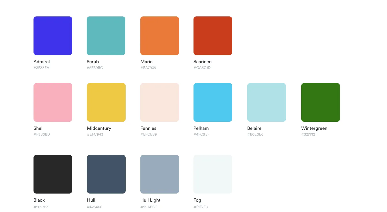 The palette, named for its midcentury influences — Saarinen, Belaire, Marin, Admiral, Scrub.
The names do some quiet work, too. Calling a red “Saarinen” or a blue “Admiral” sets the tone for the whole system: this is a brand with a point of view, not a settings panel. Every color is a flat, confident block — no gradients, no drop shadows pretending to be hospital signage.
Serif headings
Nothing says “enterprise SaaS” like a geometric sans in every slot. So headings are set in Alike Regular, a warm, slightly editorial serif — the kind of face you’d expect on a thoughtful magazine, not a dispatch tool. Body copy stays in clean, friendly Circular. The contrast is the point: the serif gives the brand a voice, and the sans keeps it readable.
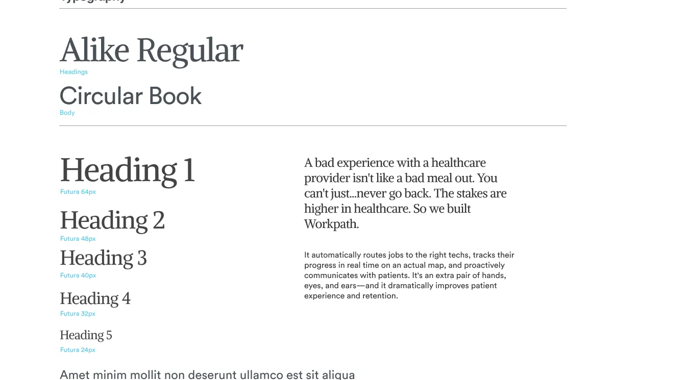 Alike for headings, Circular for body — plus the brand voice it’s meant to carry.
The copy carries the same warmth: “A bad experience with a healthcare provider isn’t like a bad meal out. You can’t just…never go back. The stakes are higher in healthcare. So we built Workpath.” The type system exists to deliver lines like that.
Geometric shapes
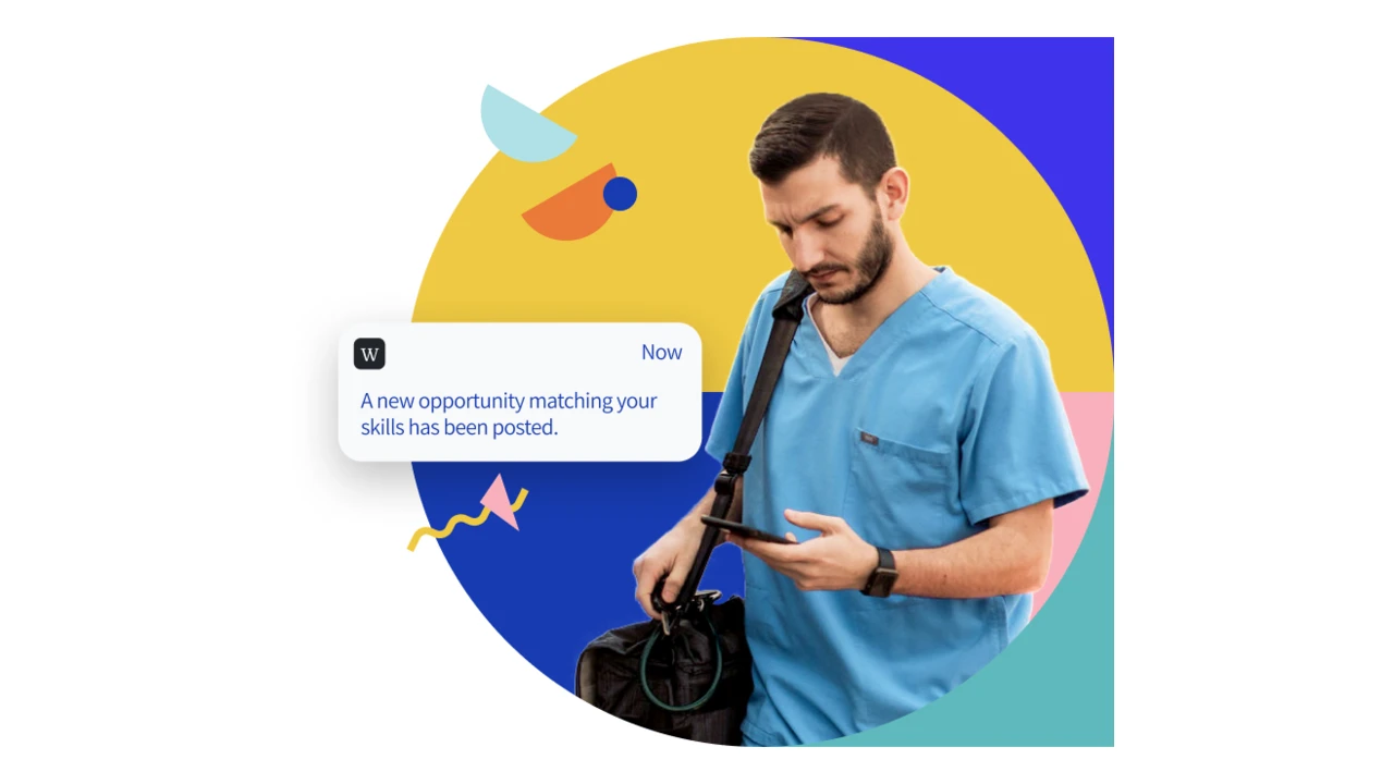
The third ingredient is a kit of geometric shapes — circles, half-moons, blobs, and little hand-drawn squiggles — that compose into friendly illustrations around real photography. They’re what keep the system from feeling flat: a bit of midcentury playfulness, always built from the same handful of primitives.
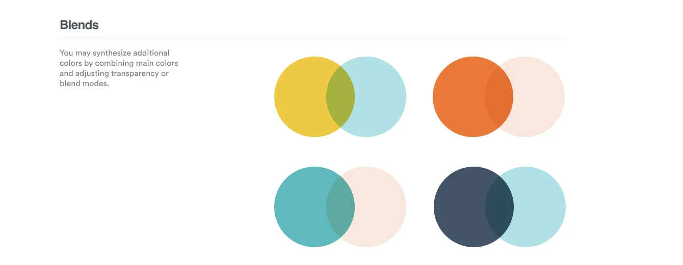 “Blends” — overlapping the core colors at reduced opacity generates a whole secondary palette for free.
The “Blends” rule is my favorite shortcut in the system: overlap two core colors at reduced opacity and you get a third, harmonious color without expanding the palette. It means the geometric compositions can be rich and layered while staying strictly on-brand, because every color in them traces back to the same small set.
Built to be repeatable
All of that only matters if other people can use it. So the system is packaged as components — pill buttons with their states, content cards, native-style messaging — sitting on top of the palette and type as reusable tokens.
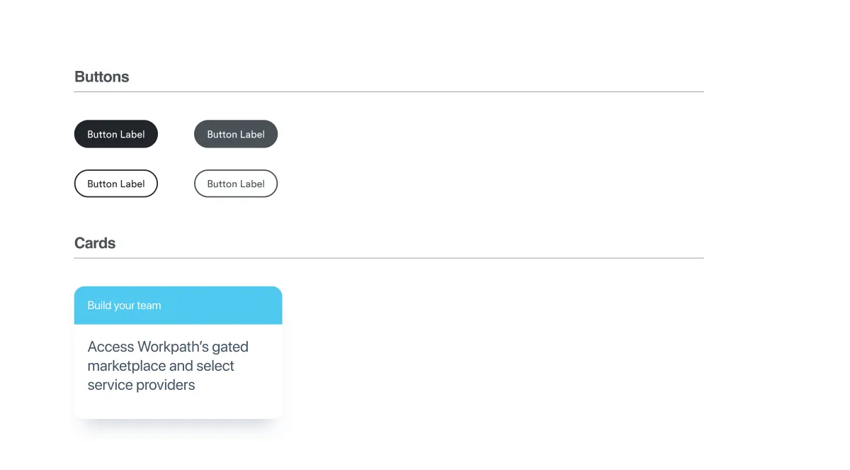 Buttons, cards, and messaging, built as components so non-designers could assemble on-brand layouts.
The test for “repeatable” was whether sales and product could self-serve. Could someone drop in a card, pick from the named colors, set a headline in Alike, and end up with something that looked like Workpath? That constraint shaped every decision — small palette, named tokens, a handful of flexible components instead of a hundred rigid ones.
The system in use
The payoff is coherence across very different surfaces. The same kit produced the marketing site — circular photography wrapped in geometric shapes, serif headlines, warm color — and the actual product dashboard, where the warmth gets dialed down but the palette, type, and components are unmistakably the same family.
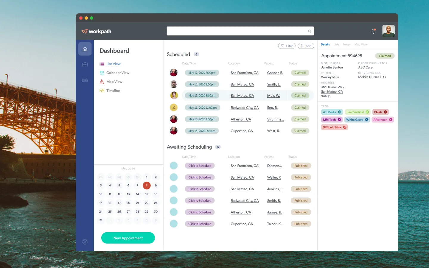 The product dashboard — quieter than the marketing pages, but built from the same palette, type, and components.
Why it worked
The trick with a “non-sterile” healthcare brand isn’t to make one beautiful screen — it’s to make the warmth systematic, so it survives contact with a sales deck and a product backlog. A tight midcentury palette, a serif with a voice, a few geometric primitives, and a small set of components turned out to be enough structure to keep Workpath feeling human everywhere, without needing a designer to babysit every page.