Case study
A Rivian owner app
A self-directed concept for an app Rivian owners might actually use — and an excuse to try two things: a deliberately "micro" design system, and visual-effects experiments inside Figma prototypes.
I kept coming back to a small idea: what would the app for your Rivian feel like if it were quiet, glanceable, and a little bit beautiful? Not a configurator or a store — just the thing you open in a parking lot to see how much range you have left and where you parked. So I built a concept for it. It was also a good excuse to try two things I’d been meaning to push on: a deliberately small design system, and some visual-effects experiments inside Figma prototypes.
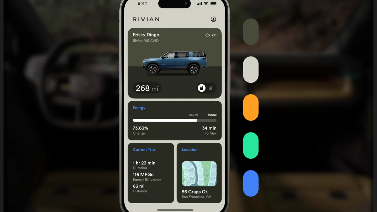
 The home screen — vehicle status, range, charge, current trip, and where it’s parked, all on one glance-able surface.
The home screen does just a few things. It names the vehicle (“Frisky Dingo,” a Rivian R1S AWD), shows remaining range with a lock toggle, then stacks an energy card (state of charge, time to full) over a current-trip card and a location card. The whole thing is meant to be read in the half-second before you put your phone back in your pocket.
A back-of-the-envelope design system
I didn’t want a capital-D Design System here — no governance, no hundred-token color ramp. I wanted a micro one: just enough structure to keep a handful of screens consistent, and no more. The test I held myself to was simple — every component had to earn its place by appearing on a screen that actually exists.
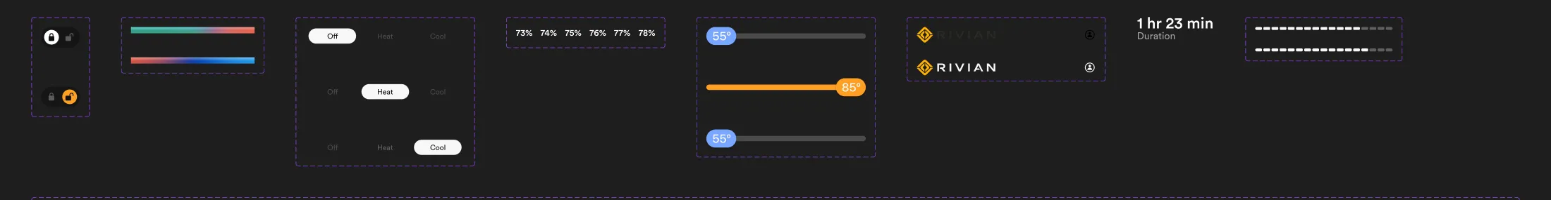 The whole kit: a lock toggle, a climate segmented control, charge-state text, temperature sliders, and the nav — each built as a component with named state variants.
So the system is small on purpose. A door-lock control with locked and unlocked states. A climate segmented control (Off / Heat / Cool). Charge-percentage text broken into states so it can be wired up in a prototype. Temperature sliders with colored thumbs. A navigation bar with a few custom glyphs. Everything is a Figma component with named variants, which means it’s reusable and easy to animate between — but it stops exactly where the concept stops. That’s the point of a back-of-the-envelope system: it’s scoped to the work in front of you, not to an imaginary future.
Experiments with VFX in prototypes
The other thing I wanted to chase was motion and atmosphere — the kind of soft, ambient visual effects that make a prototype feel alive rather than like a stack of static frames.
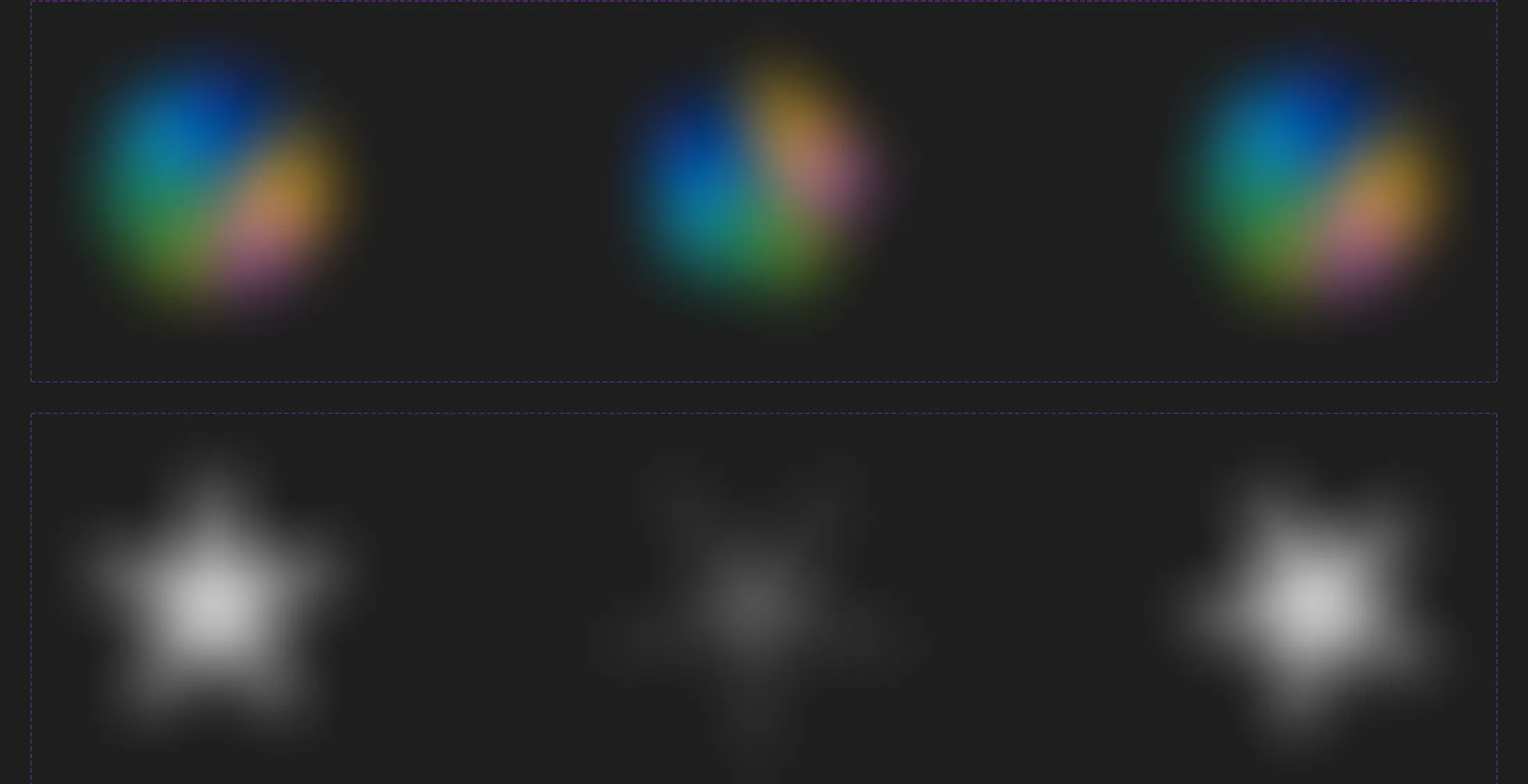 Two of the effects I built to drive prototype motion: gradient “bloom” meshes for ambient backgrounds, and the Rivian star rendered as a soft glow.
Two ideas did most of the work. The first is a set of colorful gradient “blooms” — soft radial meshes that sit behind content and drift, giving the background a living, energy-y quality without ever calling attention to itself. The second is the Rivian star rendered as a diffuse glow, in a few intensities, to use in charging and loading moments — the screen breathing while the battery fills. Building these as discrete pieces meant I could drop them into Figma prototypes and animate between states (smart-animate between the glow intensities, drift the blooms) to feel out the motion before any of it would ever touch real code.
The vehicle imagery
For the vehicle shots I used Rivian’s own source imagery — including this environmental hero — rather than rendering my own. In a shipping app these would come straight from the configurator that knows your exact paint and wheels; here they stand in to make the concept feel production-ready.
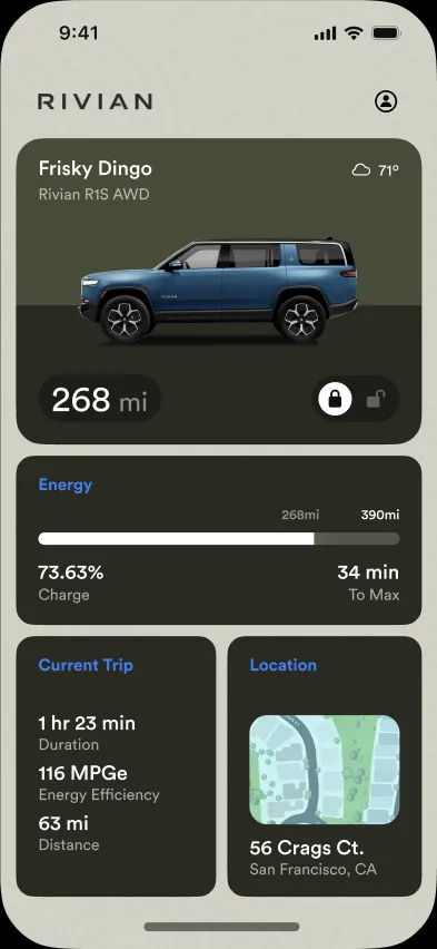
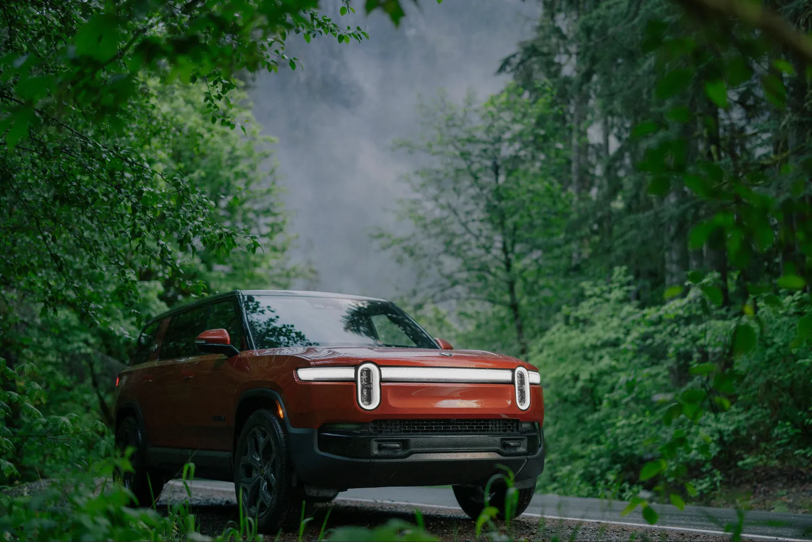 A Rivian source image, used to give the concept a production-quality hero.
What it was for
This was never meant to ship — it’s a concept, made quickly and on my own. But that’s exactly why the two constraints were useful. A micro design system kept me honest about scope and let me move fast without painting myself into a corner. And treating the prototype as a place to experiment with effects — not just demonstrate flows — turned out to be the most fun, and the most instructive, part of the whole thing.